Earlier this month, on the heels of our new logo, we also updated our website. The new site has a few exciting features that I want to walk through briefly.
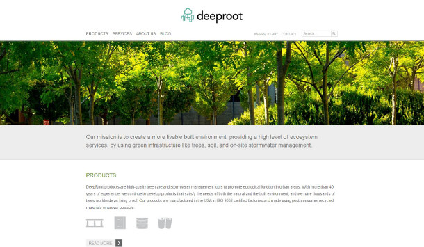
The first and more important is that it was built using responsive design – this means that the site is optimized for viewing on all of your various devices (desktop, tablet, smartphone). With an increasing number of people accessing the web on mobile devices, this was an essential upgrade.
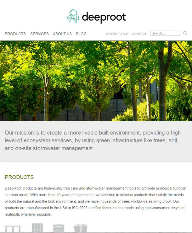
Our new website when viewed on a tablet.
While much of the content on the site is the same, there are a few notable differences.
For one, all of our products are now shown in photos rather than in illustrations, and case study photos are now bigger and easier to see.
The navigation is also slightly different – it’s all horizontal along the top, rather than on the side. In addition to that, the navigation “locks” at the top as you scroll down a page. This makes it easy to move between sections without any additional scrolling.
Another big addition is the About Us section. This was something that was badly missing from our earlier site, and I’m really pleased that we can now share more about who we are as a company, including frequently asked questions about our work, who our leaders are, the key consultants we work with, and recent media coverage. You can also now read our privacy policy, linked to in the footer of every page.
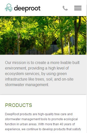
Our new website when viewed on a smartphone.
We’ll be continuing to adjust and make improvements to the site in the coming months; please bear with us if you notice any bugs. This blog will also be getting a new coat of paint in the coming months in order to keep it fresh and aligned with the look and feel of our website. In the meantime, we hope you enjoy using the new site, wherever you are and from whatever device you prefer.




Leave Your Comment